Visual Voice - Finn Nygaard Design
01. Jan. 2007
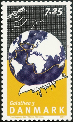
Stamp of the Galathea series illustrating "night up" and the expedition route.
Often we are not even noticing design. It just works. Design is to show us how to use things. Only when it does not work, we notice that something is wrong. Who has not tried to enter a restroom in a foreign country and have difficulties in getting water out of the taps because the button is in the floor? - Or, if you are on a train, to watch people hectically attempting to open the doors by waving their hands? Bewildered they are performing veritable dances in order to acti-vate the infrared sensor. It looks funny indeed, but being in it means to be on the verge of panic.
It is different with posters, stamps, and other design. It needs to have attention drawn to it. Like the two stamps by Finn Nygaard that will be issued on the 28th of March on the occasion of the Galathea 3 ex-pedition. A globe with the ship "The Ram" is a recur-ring feature on both stamps. So is day and night. On the first one day is up and on the other one day is down; on the first one the globe is full of live fish, on the other one the route is indicated, and "The Ram" is sailing across the southern hemisphere. In both pic-tures a satellite is floating in the upper left corner. It is always day and night on the globe. Both stamps are showing this - a fact that Nygaard is using visually in a masterly way.
The Galathea expedition is about research, but also about presentation of research. In the stamps it is shown by the small satellite in the upper left corner.
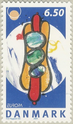
Stamp with a Hot Dog Motif
It is not the first time Finn Nygaard is making stamps. In 2005, he made two stamps with food as the motif. Particularly the stamp featuring the Danish gastro-nomic speciality, the hot dog, created a stir, probably because it was such an unexpected motif. When lick-ing the back of the stamp one tends to wonder if it would taste of mustard. Finn Nygaard himself de-clares that it is actually the role of the designer in the presentation of a message which interests him. In the bound liberty of the assignments he sees the challenge and function of the design.
In the Galathea stamps we find a motif characteristic of Finn Nygaard's production. The circle in the middle of the picture is recurring in a number of his posters. In his poster "Good morning China, Good night Eur-ope" for an exhibition in China we find the globe motif with day and night in the same picture.
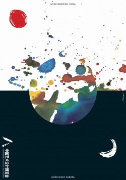
It was meant as a tribute to China, but the author-ities thought that it was too potent and the text was therefore omitted in the Chinese version. The motif itself is a precise manifestation of our globalized world. The Middle Kingdom is no longer there. It all depends on where you are, with whom you are talking, and when. Time zones, the Earth's rotation, the placing of the sun - all gathered in one picture with the continents as spots of running paint.
Posters
One of the qualities of Finn Nygaard's design is that he can bring together the conception of an idea, a theatre play, jazz, or an event in an unpretentious and effective motif. The simplicity and the ability of bringing together a complex of impressions are one side of his works. The other one is the artis-tically free processing. Often his posters consist of apparently contradictory elements. The purpose of a poster is to attract attention and commercial posters often succeed, especially when showing naked bodies; we see them, but we do not remem-ber them - which is not necessary either as long as we buy the goods they are advertising.
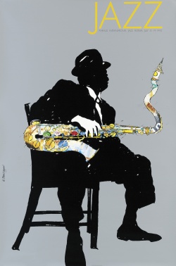
With Finn Nygaard it is, however, different. The simple, tight form catches the eye whilst the artistic and inscrutable elements make you look more closely at the picture. In the jazz posters you imme-diately catch the compressed atmosphere of the spotlight on the soloist in a jazz pub. Later on you even sense Miles Davis' trembly trumpet or Niels-Henning Ørsted Pedersen's singing bass. Music for the eye, one might call these posters.
In 1991, when Finn Nygaard was exhibiting in Rus-sia, he made a poster featuring a colourful person that rushes vigorously straight through the red flag and comes out on the other side a different person. In this simple way he depicted the transition from communism. The Russians saw it and were thrilled.
Copenhagen Telephone Kiosks
From the early history of Danish posters as an in-dependent artistic expression there is a proud tra-dition that artists would engage in the new media which could be called applied art.
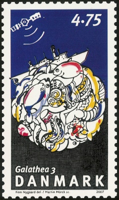
"Day up" of the Galathea series with the swarming life of the ocean.
The early posters were merely typographical; only with the invention of lithography is the picture added as an artistic expression around the mid 1890's; 100 years after its invention as a matter of fact. A great help to the spreading was the limited company called Københavns Telefonkiosker [Copenhagen Telephone Kiosks] that set up telephone kiosks with very well-placed advertising surfaces.
Among the greatest pioneers within poster design is Toulouse Lautrec. In Denmark J.F. Willumsen was among the artists who used lithography. During the next hundred years the poster had its days of glory; just think of Sven Brasch, Francisca Clausen,Viggo Vagnby, and Per Arnoldi. Today is not a propitious time for posters. With the increased commercializa-tion of everything the demand for effect has reduced the pictures to celebrities or naked bodies which certainly work, but will not be remembered.
The exhibition "Visual Voice, Finn Nygaard Design" will be shown in the foyer, on the balcony, and in the café from 28th March to 12th August 2007.
Finn Nygaard, born 1955 in Aarhus, has a number of apprenticeships and educations behind him which he has consistently interrupted when he felt that he could learn no more. From Aarhus Academy of Fine Arts and the School of Arts and Crafts in Kolding, to Rahbek Graphic Design and Finn Sködt Graphic Design he ends up establishing his own business in 1979. In 1990-95 he was a partner in the famous design enterprise of Eleven Danes. Member of the Alliance Graphique Internationale in 1997. We know many of his posters and designs from e.g. the logo of the Danish liberal party, Fætter BR [toy manufacturer], and the Egmont group [group of media companies]. The first time Finn Nygaard designed stamps for Post Denmark was in 2005.
This article may be copied or quoted with MuseumsPosten, Post & Tele Museum as source.
Comment this article
Only serious and factual comments will be published.